Design trends are complex and feed off a range of different things. As a digital agency, we
are always reading industry publications and blogs and staying abreast of the latest
innovations – while at the same time putting into practice the tried and tested designs that we
know work time after time.
As an art form (which is what digital design is) it shifts based on sentiment, technology and
changes to user preferences. Just to give you an example, the advent of mobile phones had
a big impact on the importance of mobile responsive sites that gave a tablet or mobile user
the same rich experience as a desktop user. Now mobile use has taken over desktop usage
in terms of browsing, while most users adopt a multi-platform approach using both a desktop
and a mobile device.
It’s important that we stay up to date with trends, but we don’t want to keep this information
all to ourselves! That’s why we have decided to share our top trend predictions for digital
design in 2019.
If you’re in the market for a quality website that’s going to look great and perform as
you want it to, Burger Digital is your first choice. Get in touch with us for a chat
or take a look at some of our recent work here.
Vibrant colours
We love getting briefs from clients who are after bright and eye-catching websites that really
pop, and lucky for us it looks like 2019 is going to be the year for colour! You have probably
seen the focus for businesses to stick to website-safe colours (think palettes of blue and
green) but lately, there’s been a shift towards excess (which we love).
Spotify is one brand who has gone with the supersaturated and exciting colours in
combination with softer shades and hues. The visual effect is one of extreme excitement for
the eye, but at the same time, it’s not exhausting.

Via: Spotify
Take a look at some other super-colourful websites where the focus is on more.

Via: Big Zurich

Via: RCA
We know that bright colours aren’t for every brand – but if you’re looking to set yourself apart
and aren’t afraid to colour outside the lines a bit, a super-bright site might be just what you
need. Our designers are just as happy working within traditional conventions though, so don’t worry about opting for something which is sure to appeal (but just know we’re equally
comfortable playing in either domain).
Particle backgrounds
Have you ever seen those websites with subtle motion effects in the background? These
simple animations are designed to improve the overall appearance of your website and are a
subtle piece of JavaScript that allows for movement to be included the background of your
website without compromising on load time. Take a look at this example to see this effect in
action. Pretty special, huh? We love working with all sorts of visual aids and providing that
little point of difference for our clients – so just ask us and see what we can come up with for
you.
Custom illustrations
Want to stand out online? Then steer clear of stock images and standard illustrations that do
nothing for your brand! We have seen more websites appearing with custom illustrations that
speak to the heart of the brands they are drawn for. You can find a wealth of talent on
Instagram if you are looking for a particular style – or speak to our designers and find out
about things like custom icons, hand-drawn navigation styles and a range of other options.
The sky really is the limit when it comes to custom illustrations and your brand. You need to
pipe up louder to have your voice heard in what is an increasingly-crowded market.

Via: Schmidt
Bold type
We love a good font – in fact, we’re known to obsess over fonts and typesetting. We can’t
help it — the effect that a great header has on your website can make a huge difference to
that all important first impression. Whether you’re in the market for a custom font or are
looking for something different to make a splash, we can help.
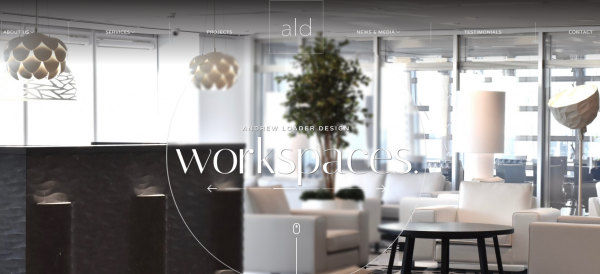
Here’s a site we designed recently for Andrew Loader design — the bold image at the start of
the page was something we knew would make a big impact for his business, and it has!

Typography is a powerful tool for creating personality and to evoke certain emotions, and we
love large lettering, contrasting sans serif and serif fonts and creating a dynamic
environment that evokes a feeling of excitement and an enhanced overall user experience.
Broken grid layouts
The idea of the broken grid is not new – not by any stretch – but it’s something that many
brands are still working with accepting. Now, it’s not for everyone – but for brands and
businesses who are a bit out there and who want to make a big splash online a broken grid
can be hugely impactful.

Via: yelvy
A traditional company is not likely to be hugely concerned with this type of layout but if your
business is looking for something different our designers are more than happy to sink their
teeth into your project.
Get in touch with Burger Digital for an exciting site for 2019
Have any of these design trends whet your appetite for something different? Contact us to
find out more about our design trends and how we can make an exceptional site for your
business. We’re in Brisbane and can serve your business no matter where you are in
Brisbane, South East Queensland and across Australia. Get a quote today!