When designing your new website we take our time getting to know your brand and figuring
out what colours are going to make your business pop online. As designers, we are on the
front foot when it comes to colour trends and ensuring that we are putting excellent work out
there. We wanted to take the time to go over some of the colour trends we’re seeing as we
move through 2019 in the hopes that it inspires you and gives you some ideas for your
website.
If you’re looking for a stunning website, you can find it here with us at Burger Digital –
we are committed to exceptional web design for our clients and are happy to discuss
any web design questions you may have. Call us on 1300 029 916 to find out more
about our rates and what we can do for you!
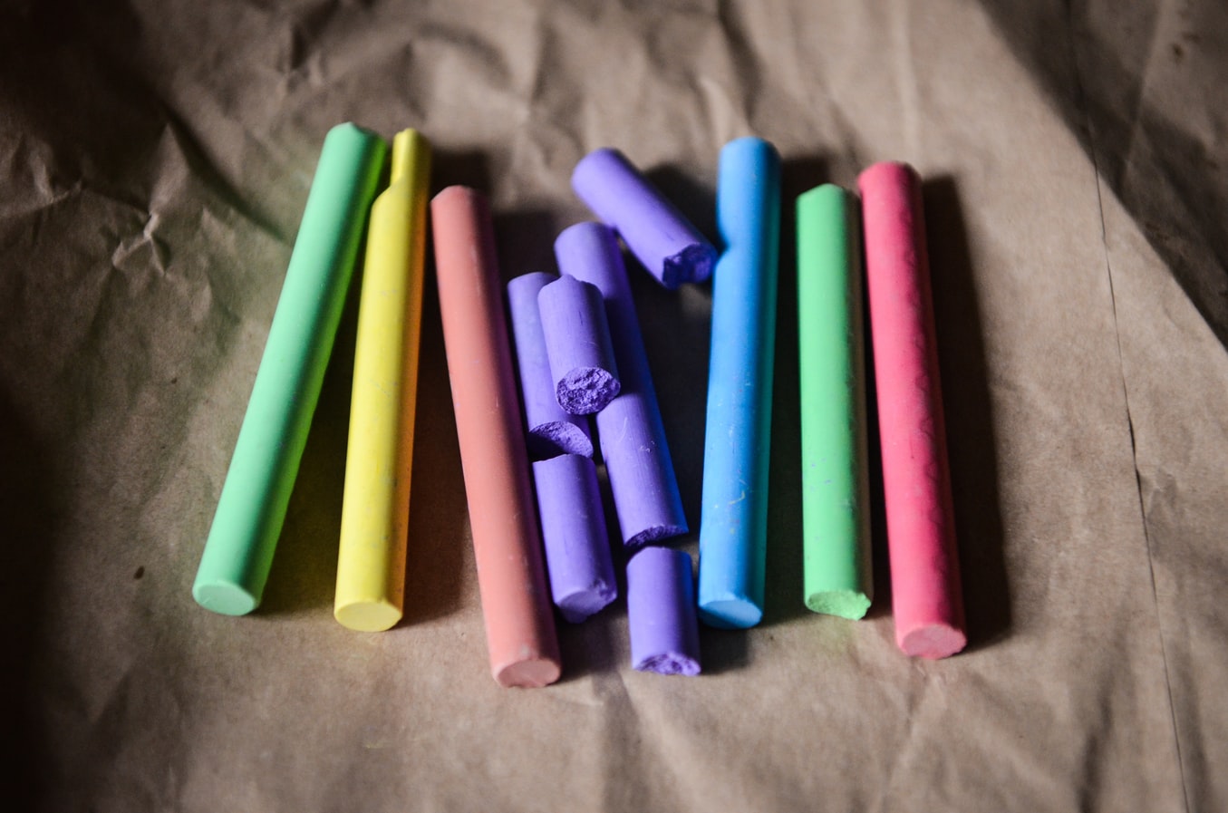
Retro colour schemes
We are seeing plenty of retro colour schemes making a bit of a re-emergence into the design
market – and we’re seeing designers abandoning the safety of neutrals in favour of
something bright and bold. After all, you want to be remembered. We’re loving the reds and
purples of the retro colour schemes like this:

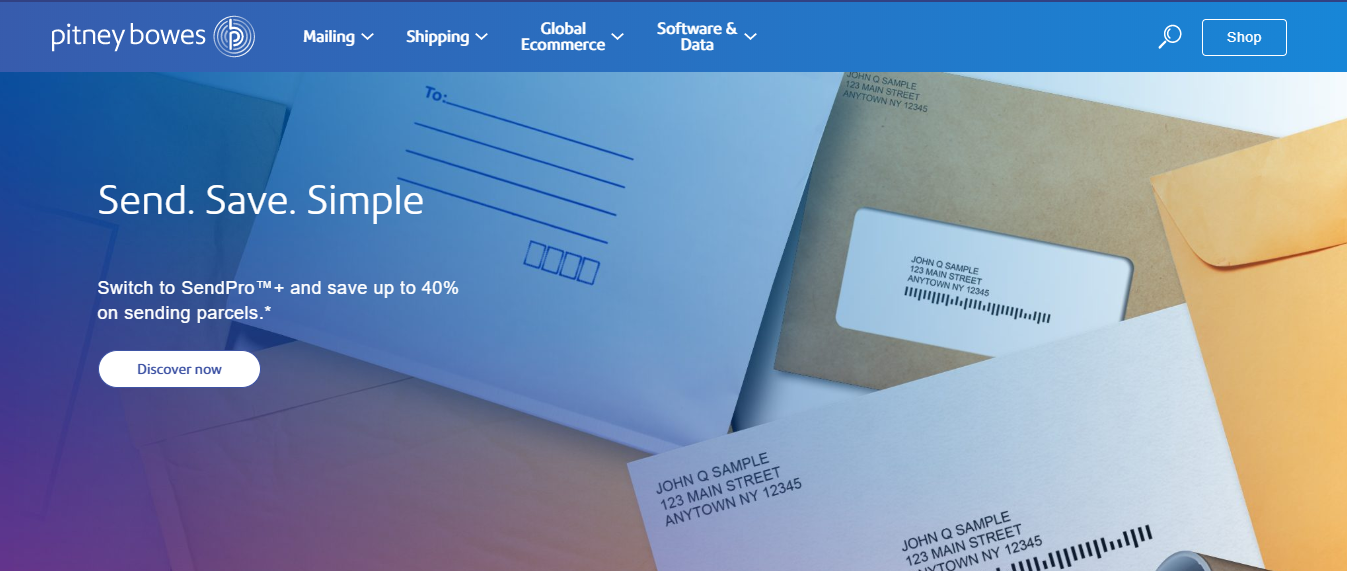
Gradient trends
Using a gradient in your website is a fun, elegant and clever way to bring people in and engage them using a pop of colour. We’re seeing (and using) gradients in design elements like the user interface, backgrounds, illustrations and overlays. We are loving the look of sites like this:
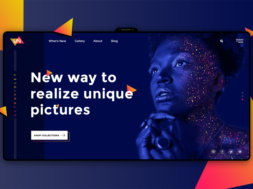
Ultra Violet
This intense purple is an incredible way to stand out and to make your mark on the world. We are loving the way in which designers are choosing to play with this incredible colour and making it their own. This is not a colour for the faint of heart, or for a brand where the aim is anything except being remembered. That said, we love the use of Ultra Violet in combination with golds, whites, and yellows. You can be sure that your business and website will be remembered with Ultra Violet in your colour palette.
Duotone sites
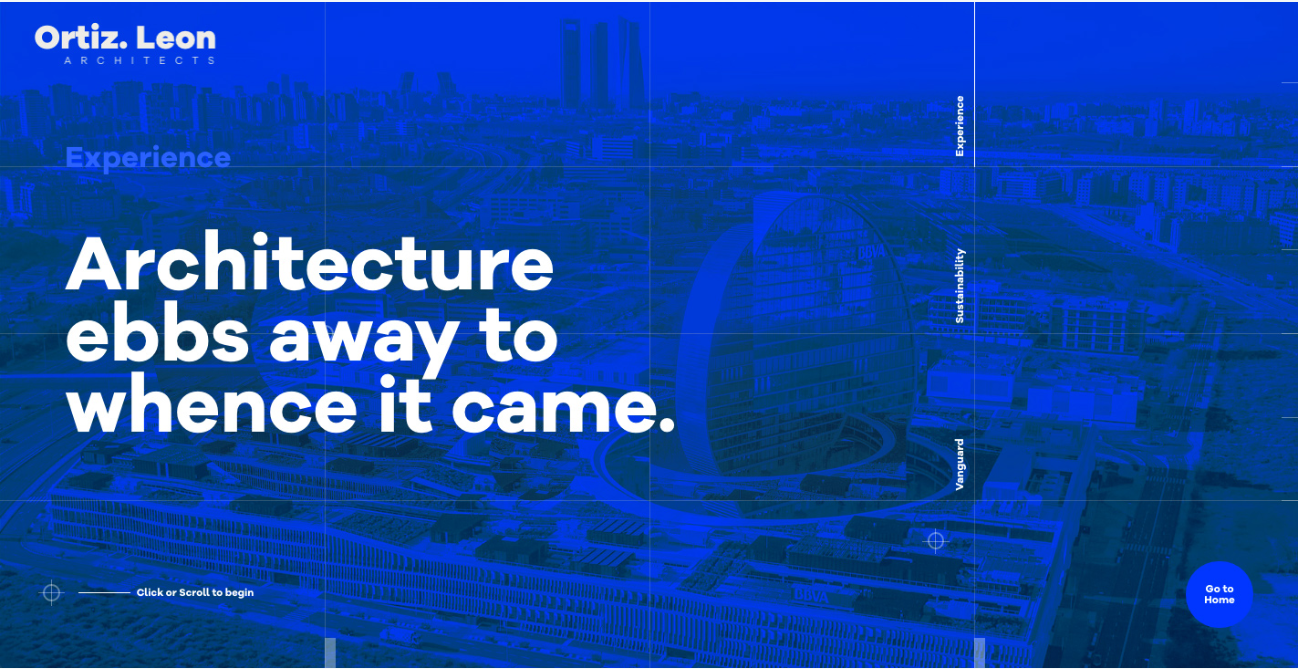
We have moved away from the business and noise of web design as it existed a few years
ago and shifted into an age where colours are restrained, and where web designers are
using duotones to give brands pop. After all, you can stand out in a world where everyone is
noisy just by being quiet. Or in other words, when others zig you should zag. The duotone
site is one where just two colours are used in various gradients to give effect to a visual. It’s
a stunning effect and one with a surprising amount of impact.
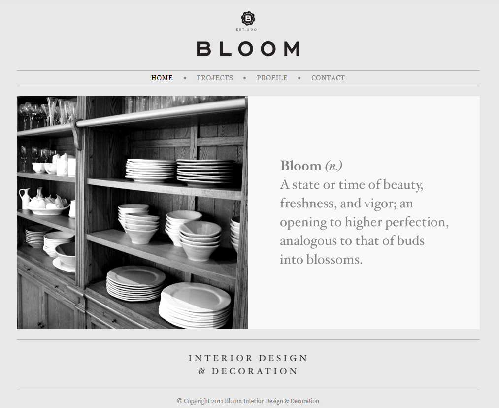
Grey
This is a stunning effect when it is completed effectively, and while it’s not for every brand –
some businesses simply need colour – it can work very well for a restrained brand. At Burger
Digital we can deliver exceptional grey-themed websites where the focus is on the content;
we know that black and white images look stunning sitting alongside a grey theme. Grey
themes can also be complemented with a pop of colour – just a single accent colour,
perhaps a gold, or a red – and will make everything seem positively overwhelming by
comparison. Your grey website will be a cool, refreshing place to come after the noise of the
internet.
Need a new website?
Call us today. We are based in Brisbane and can help you with business rebranding and
websites for businesses of all types. Take a look at what we have done for businesses just
like yours and for any information about our services please call us or get in touch online.
Call us on 1300 029 916 to find out more about our rates and what we can do for you.
The burgers are on us!
